1. 前言《虚拟机在线迁移实验》 一文中,模拟了CPU压力、内存压力、磁盘压力还有各种网络故障,得到了这些条件下虚拟机在线迁移的性能数据。《ApacheBenchmark和gnuplot》 一文中,找到了测试Web应用性能的方法,学习了gnuplot的基本用法。
本文,就利用gnuplot给迁移过程中得到的性能数据进行绘图,绘图结果用于写论文。
2. 数据处理gnuplot的数据是纯文本的,不带单位的,按列分布的。那么首先就要处理下数据,使之符合gnuplot的要求,以CPU数据为例,处理后的数据如下:
1 2 3 4 5 6 7 8 9 10 11 12 0 % 18 6 .28 283 248 10 % 20 6 .53 353 341 20 % 19 4 .52 323 300 30 % 20 4 .58 354 338 40 % 21 4 .62 336 347 50 % 20 5 .41 355 323 60 % 19 4 .54 303 309 70 % 21 5 .24 356 355 80 % 19 4 .41 351 338 90 % 17 7 .31 328 362 99 % 19 5 .77 351 348
3. 绘图3.1. 设计绘图,最基本的,要知道绘图的目的,想要显示出哪些信息?然后考虑绘制什么图?柱状图还是折线图?x轴是什么?y轴是什么?要不要第二坐标轴?
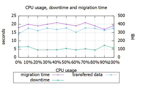
3.2. CPU与迁移性能1、按照以上设计,新建cpu.plt,内容如下:
1 2 3 4 5 6 7 8 9 10 11 12 13 14 15 16 17 18 19 20 21 22 23 24 25 set title "CPU usage, downtime and migration time" set key below box 1set xlabel "CPU usage" set format x "%g%%" set ylabel "seconds" set yrange[0:25]set ytics 5 nomirrorset y2label "MB" set y2range[0:500]set y2tics 100set gridplot "cpu.dat" using 1:2 with linespoints title "migration time" ,\ "cpu.dat" using 1:3 with linespoints title "downtime" ,\ "cpu.dat" using 1:4 axis x1y2 with linespoints title "transfered data" pause mouse
2、gnuplot cpu.plt,执行脚本绘制图片
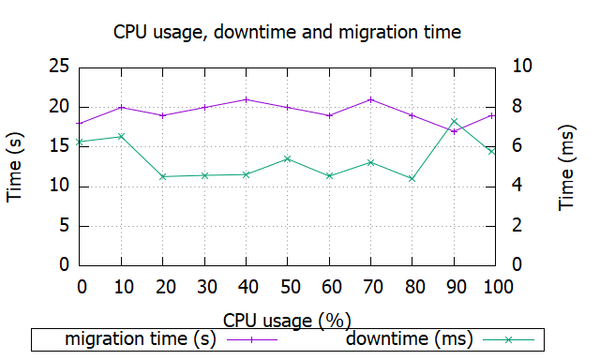
3、新建cpu1.plt,绘制迁移时间和停机时间
1 2 3 4 5 6 7 8 9 10 11 12 13 14 15 16 17 18 19 20 21 22 23 set title "CPU usage, downtime and migration time" set key below box 1set xlabel "CPU usage (%)" set ylabel "Time (s)" set yrange[0:25]set ytics 5 nomirrorset y2label "Time (ms)" set y2range[0:10]set y2tics 2set gridplot "cpu.dat" using 1:2 with linespoints title "migration time (s)" ,\ "cpu.dat" using 1:3 axis x1y2 with linespoints title "downtime (ms)" , pause mouse
4、新建cpu2.plt,绘制迁移数据量
1
2
3
4
5
6
7
8
9
10
11
12
13
14
15
16
17
# graph title set title set # x-axis set # y-axis set set set plot "cpu.dat" using #pause pause
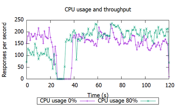
3.3. CPU与吞吐量1、性能测试
1
2
ab -g cpu0.dat -t 120 -n 10000000 http://10.0.2.154 /ab -g cpu80.dat -t 120 -n 10000000 http://10.0.2.154 /
生成cpu0.dat和cpu80.dat两个文件。
2、处理ab数据,计算吞吐量
1
2
3
4
5
6
#!/bin/bash for var in {0,80}do start_time=`awk '{print $6}' cpu${var} .dat | grep -v 'wait' | sort | uniq -c|head -1|awk '{print $2}' ` awk '{print $6}' cpu${var} .dat | grep -v 'wait' | sort | uniq -c|awk -v t=${start_time} '{print $2-t,$1}' > cpu${var} -t.dat done
生成cpu0-t.dat和cpu80-t.dat两个文件。
3、填充空缺数据为0
1
2
3
4
5
6
7
8
9
10
11
12
13
14
15
16
17
18
19
20
21
22
23
24
25
26
27
#!/bin/bash for var in {0,80}do array_str=`cat cpu${var} -t.dat | awk '{print $1}' ` array_str2=`cat cpu${var} -t.dat | awk '{print $2}' ` IPS=' ' array=($array_str ) array2=($array_str2 ) index=0 count=0 max=121 echo "#cpu${var} " > cpu${var} -tf.dat while ( [ $index -lt $max ] && [ $count -lt $max ] ) do if [[ ${array[index]} == $count ]] then echo "$count ${array2[index]} " >> cpu${var} -tf.dat index=`expr $index + 1` count=`expr $count + 1` else echo "$count 0" >> cpu${var} -tf.dat count=`expr $count + 1` fi done done
4、新建cpu3.plt,绘制吞吐量
1
2
3
4
5
6
7
8
9
10
11
12
13
14
15
16
# output as png image #set terminal #set # graph set set # x-axis set # y-axis set plot "cpu80_tf.dat" using pause
4. 后记内存压力、磁盘压力、网络故障等条件下的实验结果绘图,和CPU压力类似,详情参考live-migration-plot 。
对于吞吐量的绘图,还有很多需要完善。比如说取样,绘制所有CPU占用率下的吞吐量会太乱,取样少了又没有对比,所以2-4条是比较合适的。再比如说时间间隔问题,输入ab测试命令后,输入迁移命令,这中间存在时间间隔。而且通过观察吞吐量曲线,也无法看出从何时开始进行迁移,只能看出停机时间。